Building an iOS game in 2 months

Hi there, in this post I would like to give you some insight into how my business partner Julian (UX/UI Designer) and I (iOS/macOS Software Developer) created our new puzzle game “TipTapColor 2” in the last two months, starting with an idea, up to the finished game. This hasn‘t been our first iOS mobile app, but it is our first puzzle game.
Earlier last year I took an introductory course on artificial intelligence (low-level concepts such as states-graphs etc.) at the university and one commonly used example was the 8-puzzle.
Most of us know these sliding puzzles, many of those already exist, and still in mid-August Julian wanted to test his experience as a UX/UI & concept designer and created a fully mobile game of a 24-puzzle, in a colorful variant, in less than 2 weeks!
My part in the project is pretty simple: I give feedback during the conception phase, so the full prototype is as complete as possible and that the game mechanics are thought through enough, and afterwards… I take the UI prototype, lock myself in my room with a coffee machine, and do not come out until I finished programming the actual game (just kidding, didn‘t lock the door, still had to get food from the fridge).
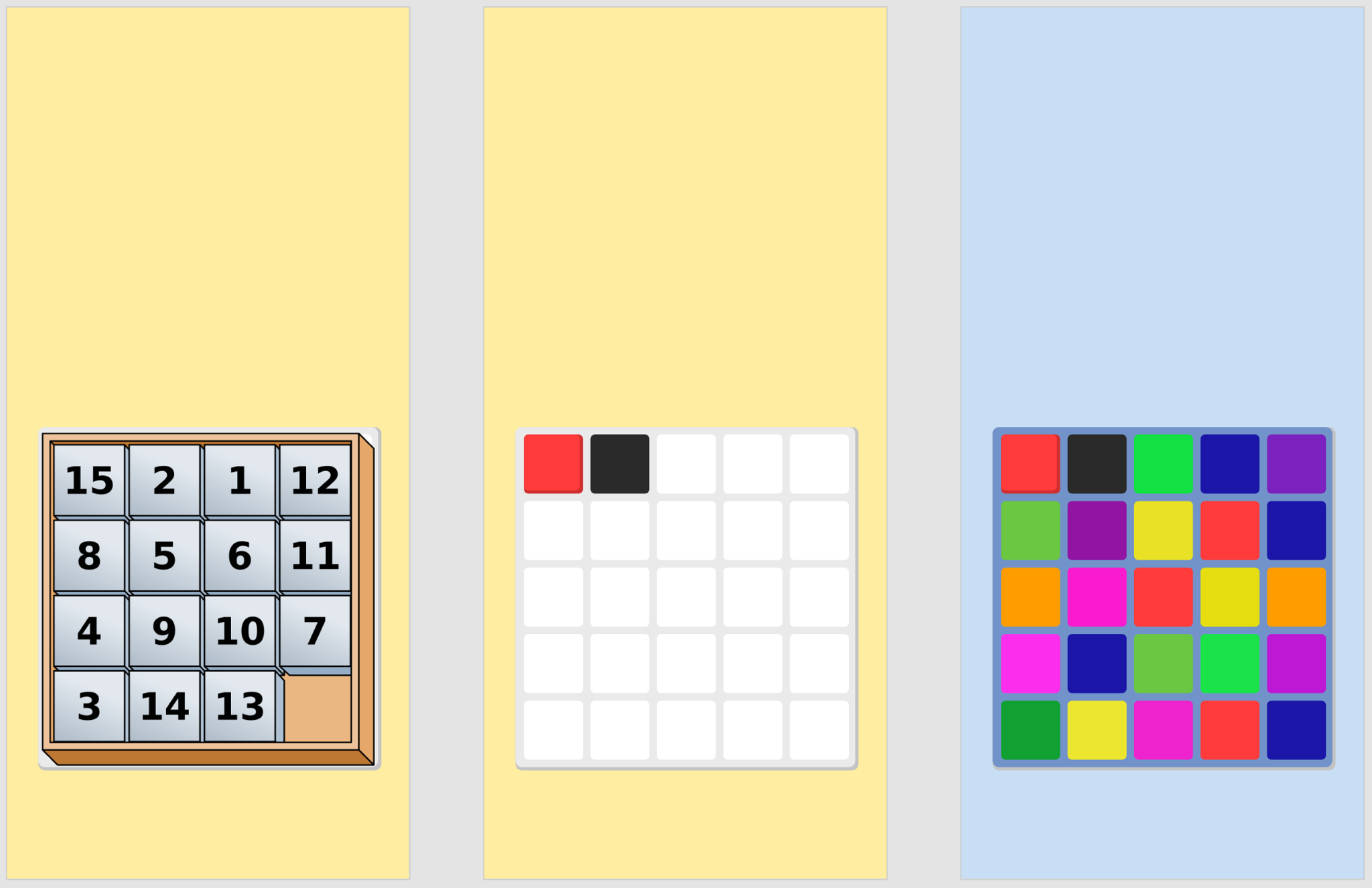
In the picture you can see how an idea (1) becomes a simple view (2) which changes over time (3).
After a few days, he got the great idea of setting color constraints for columns and rows which must be met to actually win the game (1). The core game mechanic was born.
Now we had to think about how we could challenge the player so that you would keep playing (after all that’s our goal). First, we thought of a random mode, basically starting off with random tiles and random constraints, but went for a level concept as it would visualize progress more.
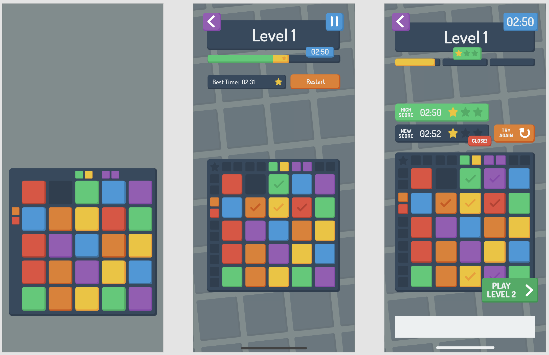
We do not want to stress a player, therefore the time to finish a level does not run out (2). Instead, you can get more incentivized if you are fast — you can collect stars. (3)
Our idea is straightforward: play levels as often as you wish, get better every time and get enough stars for the next levels.
Every game needs a menu, which is most likely the first thing a new player sees.
That‘s why ours must be intuitive, easy to understand, as general as possible (hardly use words as language is always a barrier), and also a big part is accessibility for color blindness (after all the game is based on colors).
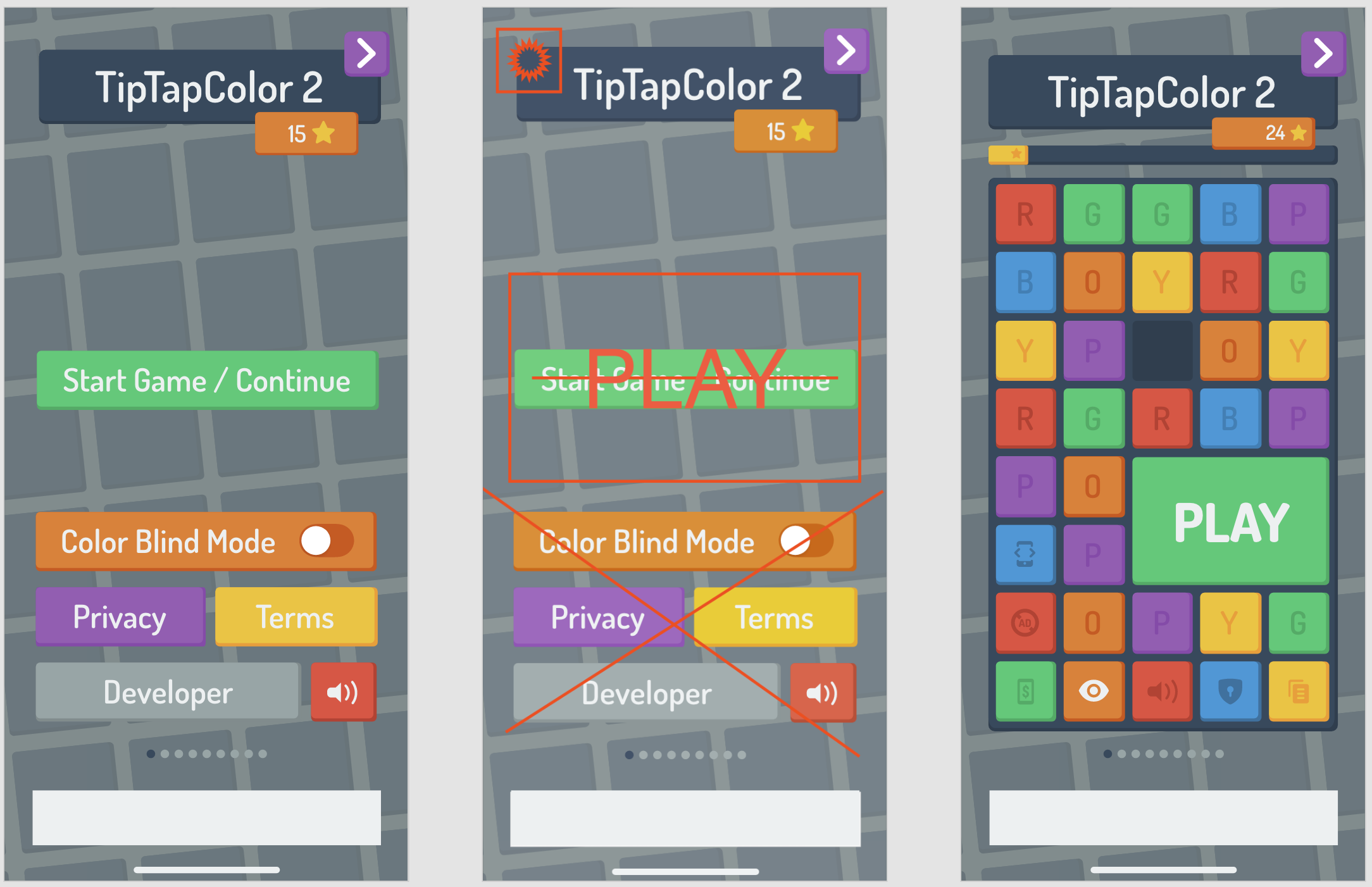
The first prototype started off as a simple screen defining the options and actions (1). Some initial feedback from my side was the impression that it is too overwhelming for a newbie (2) and multiple iterations later I received a clean design, with simple options, clear actions, and an integrated color blind mode (3). And everything matches the design of the in-game. Great job Jules!
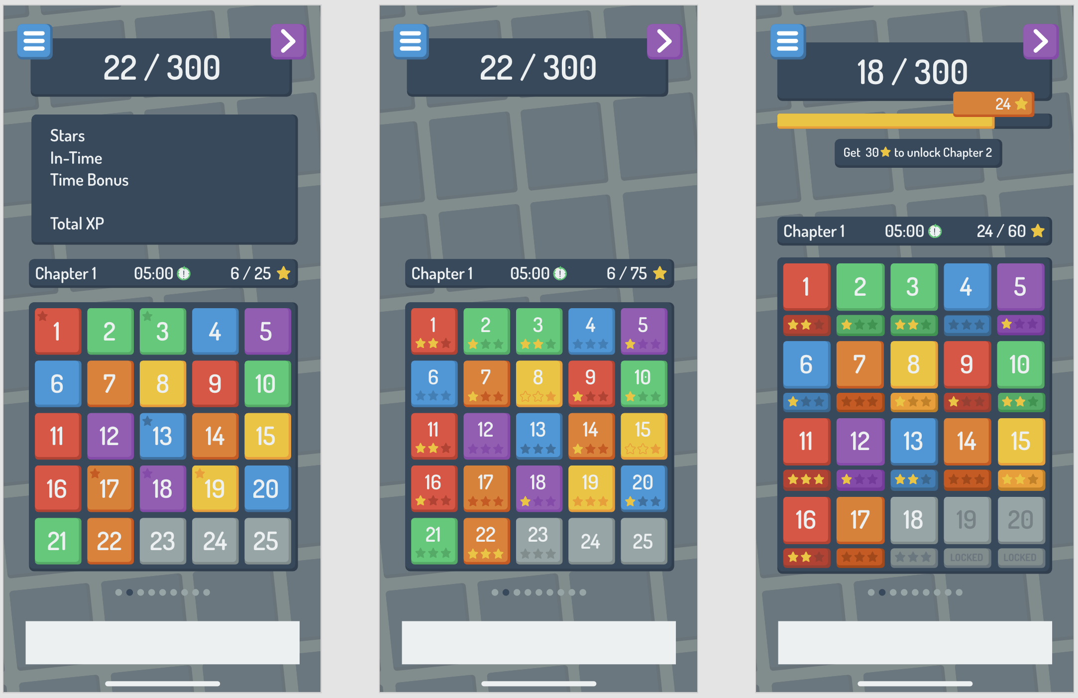
Now to return to the level design, another issue appeared: To give the player a challenge, he/she needs to collect enough stars to unlock upcoming levels. Therefore you need to replay a level. But, if you always need to get at least one star in a level to unlock the next one, a player might get stuck, which conflicts with our approach „Challenging but always playable“.
Therefore we decided to use a chapter-based approach. Every chapter consists of 20 levels, which you can easily play one after another, without the necessity of actually being fast enough to get a star. Now if you reach the end of the chapter, this is the first challenge, which requires you to replay the levels until you collected enough stars to pass.
This should give enough freedom to always be able to play more levels, but also give enough reason to be fast enough.
For a moment Julian thought about using an experience-based concept (1) but quickly switched to the star-based one (2). A few design iterations later, a global progress bar and a unified tile design give the user all necessary information. (3)
Now about my part: actual programming. It’s quite technical but I’ll try my best to keep it understandable :)
In software projects, early decisions have the biggest impact. During my brainstorming session, I had to think about portability, scalability, and time management.
I could have used a cross-platform 2D game engine such as Unity, cocos2dx, or even just SpriteKit, but I am an expert in native iOS/Swift development, and we wanted to create a working game as fast as possible and therefore decided to go with iOS-only (for now).
At this point, I also realized that no parts of the game are acting in real-time: no moving objects except a timer. Therefore I simply didn’t need a real-time 2D game engine.
Also designing a UI in a game engine is such a pain, especially a user interaction and layout. So I said to myself “why reinvent a button? All elements are very simple, use the default elements and customize them” so that’s why I went with basic UIKit.
For scalability (meaning more features over time) I used the same architectures as I taught myself in the last 7 years of iOS development. More on that later.
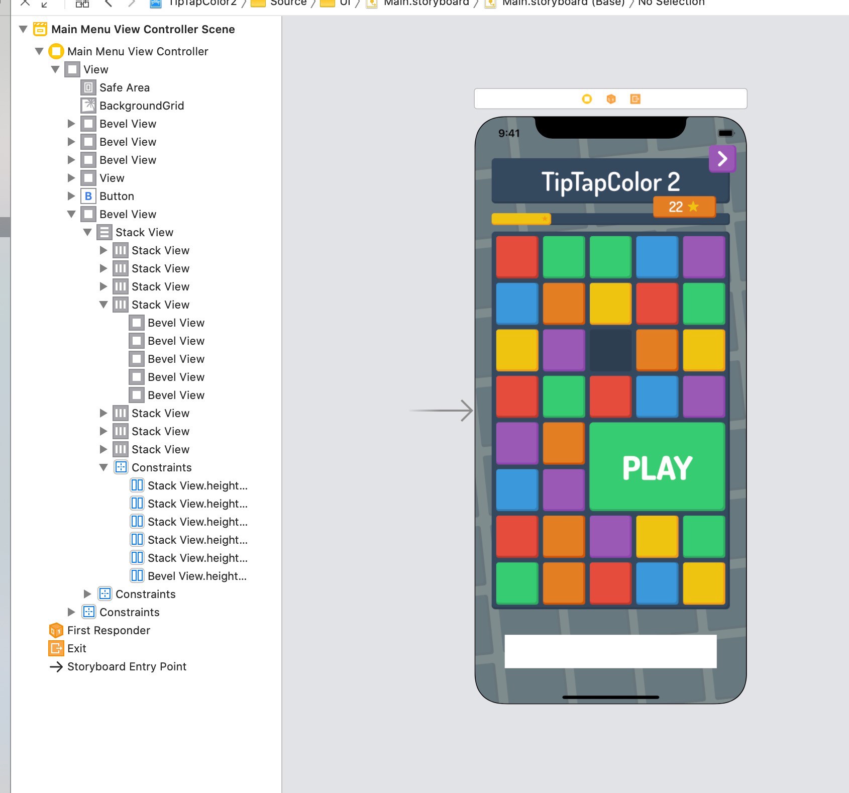
In the picture, you can see an early screenshot from the Xcode Interface Builder. At that stage, I was able to model almost everything in there.
After a while, the number of elements grew a lot. Luckily I always used a clean structure and reused nested components.
For example, in this view, you can see many tiles, buttons, and indicators, all looking quite similar. I achieved this by creating a custom Tile UI element that allows being configured with parameters, e.g. color or corner radius, then then I modified the built-in buttons to use this tile as the background. This way I can still keep building in the interface builder.
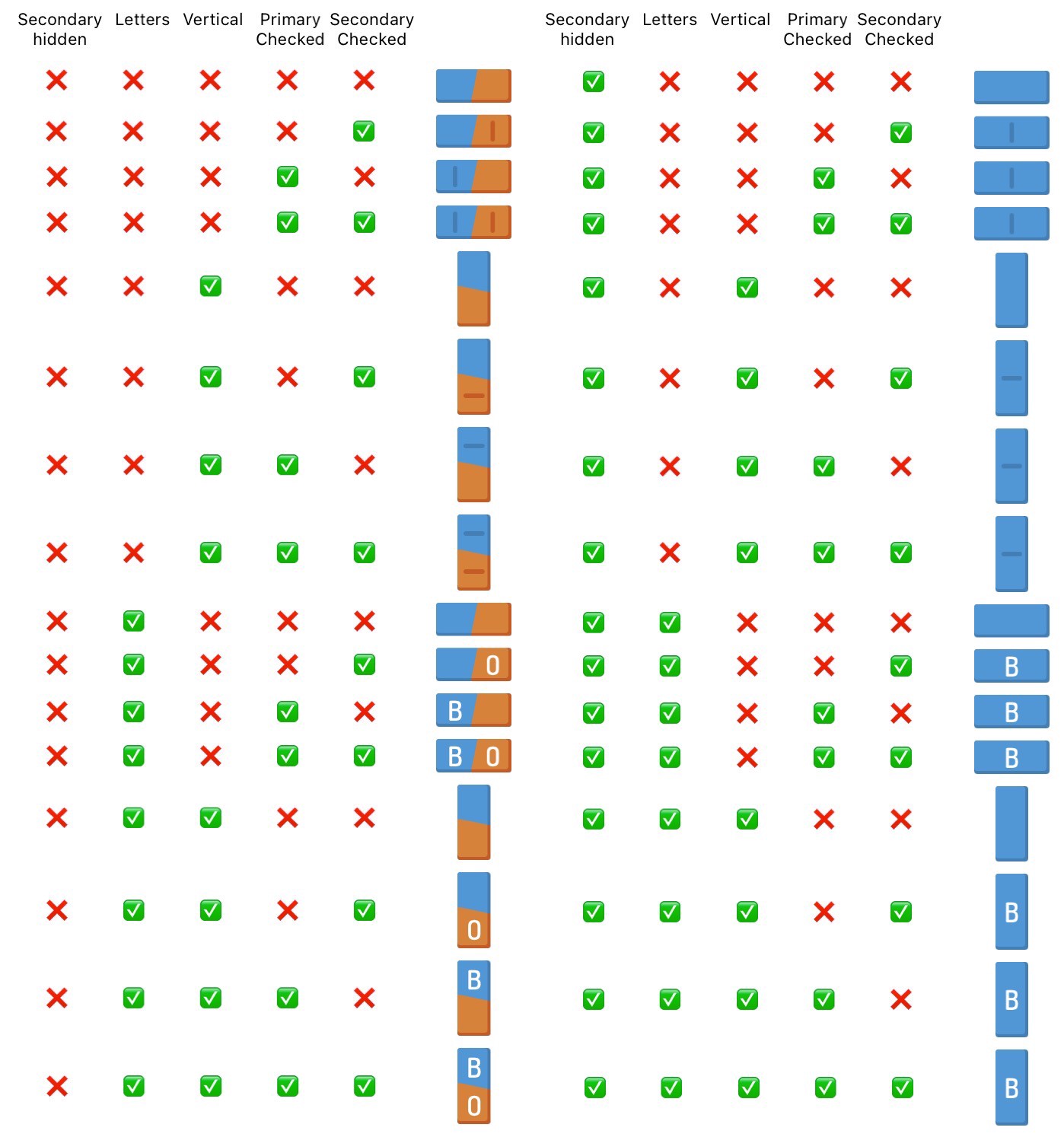
Of course, I had to create some custom components, for example, this one right here which I used to show the player the level constraints.
As this component can be configured with more than five different parameters, many different states can appear. This screenshot is a little older, as by now I am working on an automated test to verify the behavior.
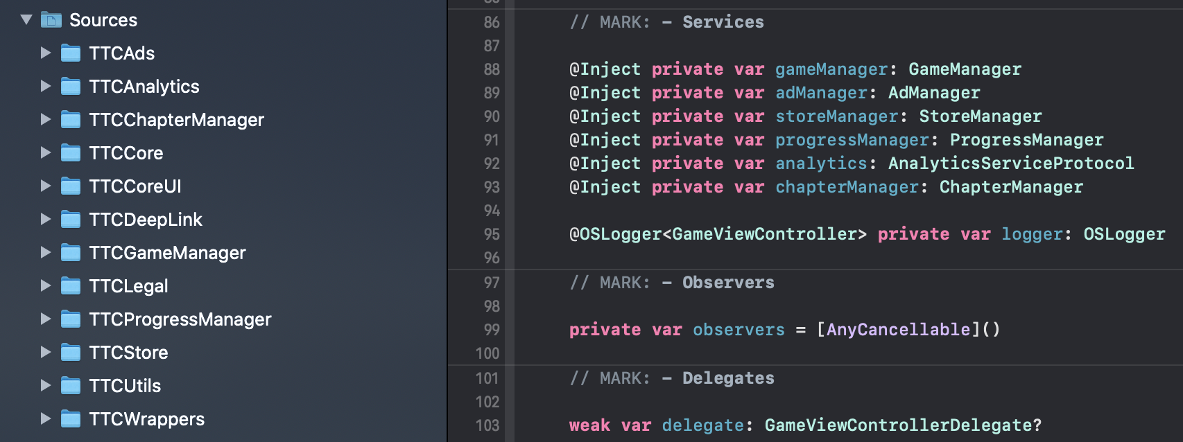
As I mentioned before I used different techniques to organize the code. One of them is creating independent modules I can reuse. This way I am able to add and remove new features if necessary.
One use case is the iOS 14 App Clip support. An App Clip is a slimmed-down version of the full app, with a size limit of 10 MB (ours has about ~3.5MB).
As the App Clip doesn’t need e.g. the In-App-Store, I can easily meet the size limit by not even including it.
I don’t want to get too technical, but for you nerds (like myself): Create services in individual modules, loose bindings using protocols and use dependency injection instead of static members. Also if you are programming with Swift, create individual files per class/protocol/extension so you can easily move code to different packages if necessary.
Also, the game is available on the iOS App Store and I would love to hear your feedback: https://apps.apple.com/app/apple-store/id1530593824?pt=119253046&ct=Imgur&mt=8
Thank you so much for reading! If you would like to know more, follow me on Twitter: @philprimes and send me a DM with “Tip Tap Color 2 has so many colors!”
Related Articles